Details of Project
Work done in:

Product: Website page
Company: Pandora BRAZIL
Position: UI & Product Design
Language used: Portuguese*
Purpose
The customer requested a landing page for Black Friday 2021 to showcase discounted products and enable users to make faster purchases. This landing page was exclusive to leads.
There are 8 collections in total.
Because of this, I conducted a Heuristic Analysis to improve the accuracy of the element distribution.
- Timeless
- Pandora ME
- Pandora Moments
- Star Wars
- Reflexions
- Harry Potter
- Pandora Signature
- Disney

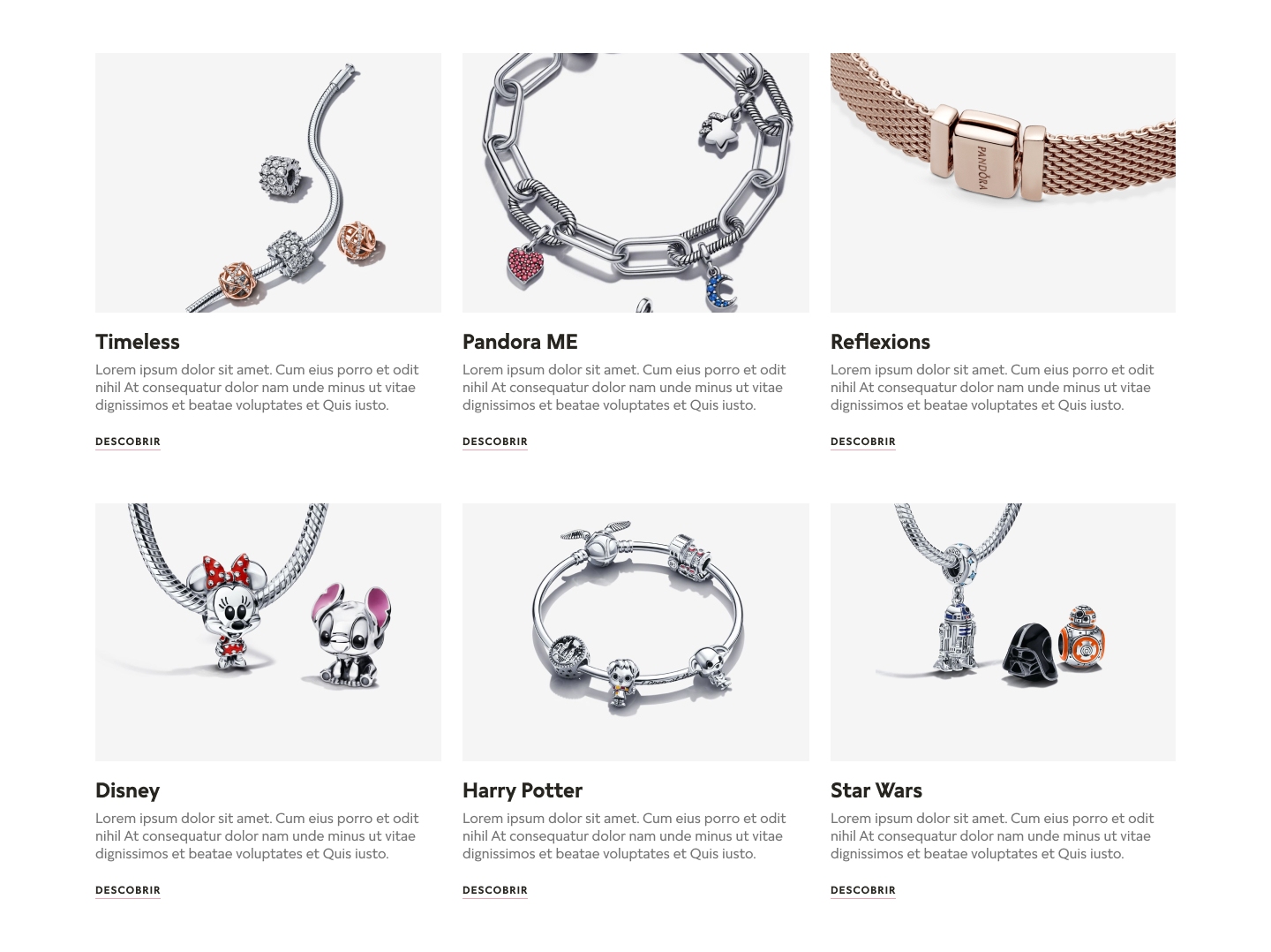
I have placed images of the jewelry within each collection to which they belong. These pieces were inserted in a way that highlights their details, further enhancing their value.
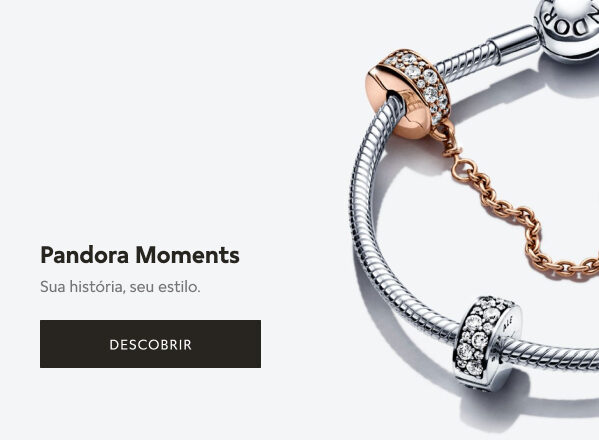
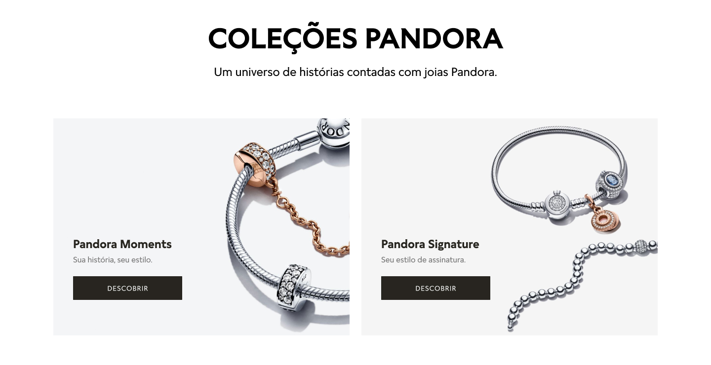
I highlighted Pandora’s two main collections, placing them side by side under the title and subtitle. For each collection, I suggested a phrase and added a CTA.
Translate:
Title: Padora Collections
Subtitle: A universe of stories told through Pandora jewelry.
CTA: Discover


I highlighted Pandora’s two main collections, placing them side by side under the title and subtitle. For each collection, I suggested a phrase and added a CTA.
Translate:
Title: Padora Collections
Subtitle: A universe of stories told through Pandora jewelry.
CTA: Discover

The other collections were arranged in rows of three, with information about each one below the images. I provided three lines of space for the descriptions and included a more discreet button.

At the bottom of the page, I added a promotional banner for the jewelry box, as customers will need a suitable place to store jewelry from their chosen collections.
I allocated one line for the title, two lines for the description, and a ‘check it out’ CTA.
At the bottom of the page, I added a promotional banner for the jewelry box, as customers will need a suitable place to store jewelry from their chosen collections.
I allocated one line for the title, two lines for the description, and a ‘check it out’ CTA.
