UniPsi: Psychological care for university students beyond geographical barriers
Connecting psychology professionals and patients in a way effectiveness and uncomplication
Collaborative work by Samantha Fonseca & Aline Pagnossin | 2021
understanding
Faced with the need for technological adaptation and inclusion in different areas of the market, during the Covid-19 pandemic in 2020, based on UX Design, we challenge ourselves to propose an alternative that connects psychology professionals and university patients, beyond geographic barriers and face-to-face consultations, in a flexible, effective and uncomplicated way.
How to reduce the post-pandemic stress effects index, maintaining remote service assistance?
how we used
UX Strategy
Qualitative/Quantitative Research
CSD Matriz
User Journey Map
Personas
Usability Testing
Heuristic Analysis
Wireframes
Low and High Prototype
Background
According to the World Health Organization (WHO), Brazil is the country with the highest number of anxious people in the world, totaling 9.3% of its population.
The world has been changing rapidly and in increasingly intense ways. As a consequence, we are dealing with the psychological impact of a society that needs to constantly unfold to keep pace.
The university public has been strongly
confronted with the need to adapt to new forms of learning, routine organization, work conciliation, family and financial issues, among others.
The fact is: the impossibility of displacement or face-to-face attendance, overloaded routines, difficulty of access to professionals, among others, are factors that have reinforced how remote psychological attendance is no longer just “another reality” and has become, increasingly, “a necessity”.
UX RESEARCH
We identified that the users of this product are university patients who seek psychological care at a distance/remote, without any physical contact, and also Psychology professionals who want innovation, flexibility, to increase their patient network and adapt to the “new normal”. To understand these publics and solve their problems, we profiled each one and made protopersonalizations so that we could then validate all the information through surveys.
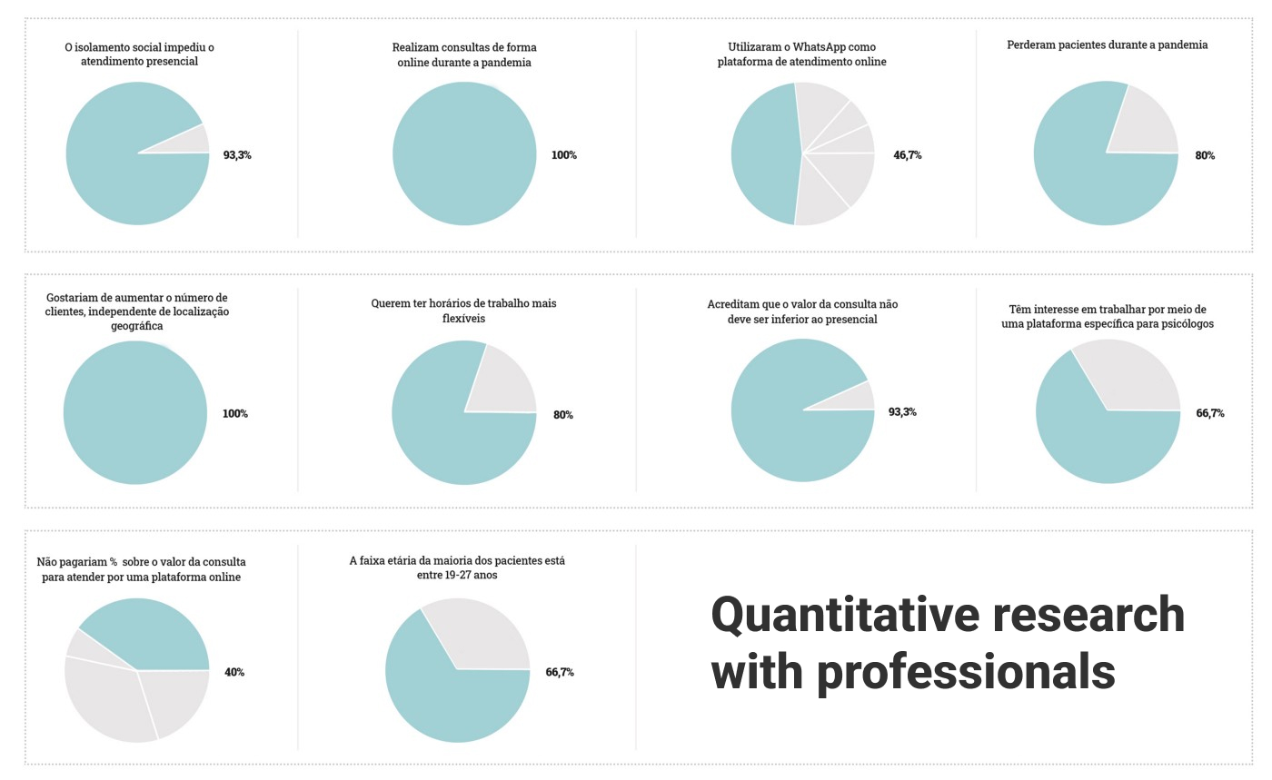
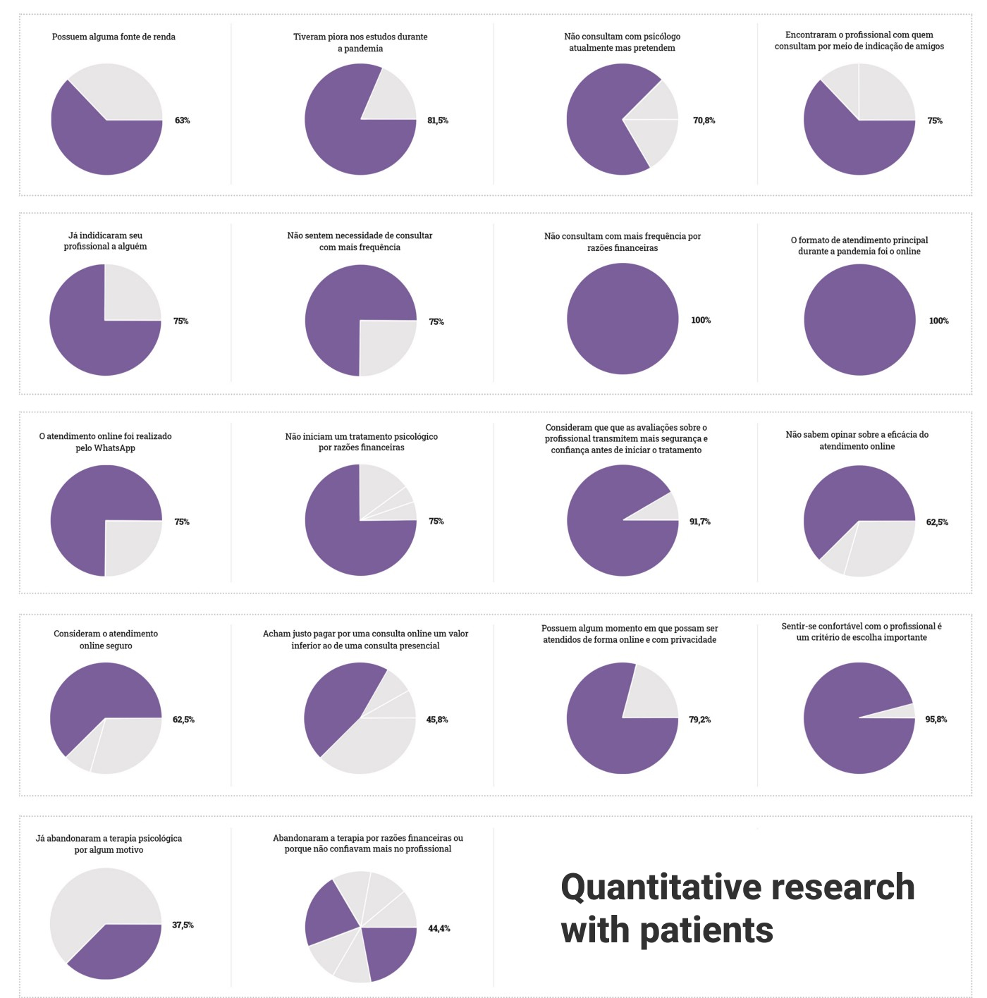
Quantitative Research
In order to understand WHAT is wrong, that is, what problems need to be solved.
Qualitative Research
In order to understand WHY it is wrong, that is, why these problems occur.
Quantitative Research
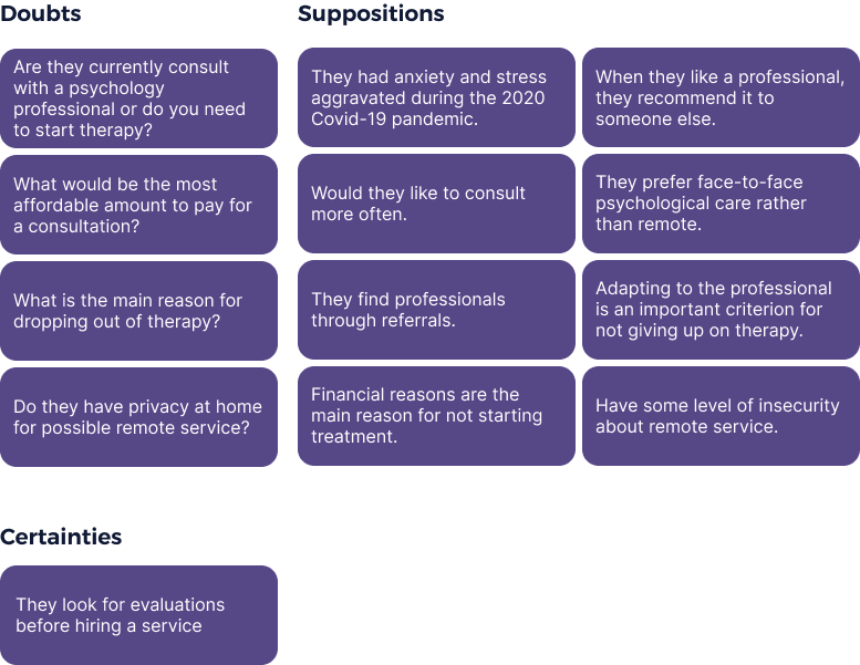
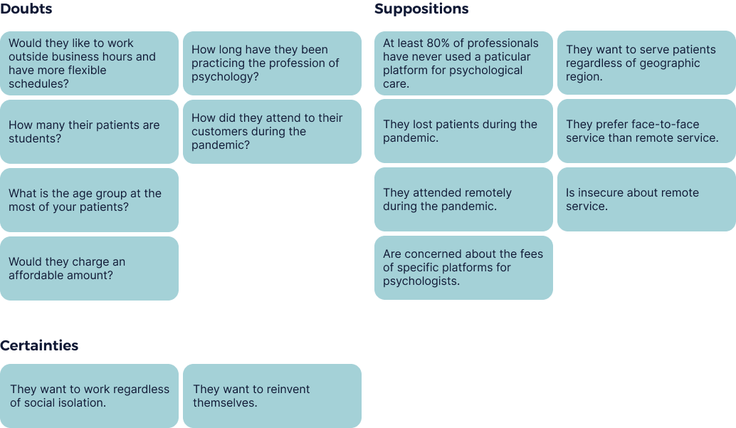
To guide the quantitative research, first, some certainties, doubts and assumptions were defined that were believed to be part of the journey of “patients” and “professionals” in psychology:
CSD MATRIX
Patients
CSD MATRIX
Psychologists
CSD MATRIX
Psychologists
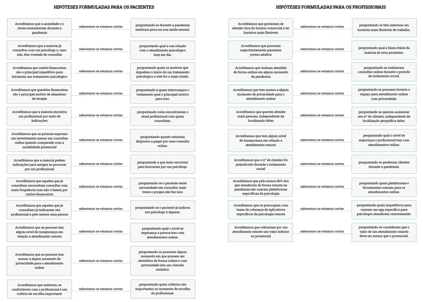
Hypotheses
To guide us in developing the questions on the form, we formulate hypotheses and how they would answer the doubts and assumptions we selected.
Offical image
Some exemples | Patients
We believe that stress and anxiety increased during the pandemic
We will know if we are right
Asking if during the pandemic they experienced a worsening of their mental health
We believe that most people find a professional through referrals.
We will know if we are right
Asking how they found the current professional they are consulting with.
We believe that most of them have already consulted a psychologist and, if not, they are willing to consult.
We will know if we are right
Asking what their relationship is with psychological care today.
Some exemples | Psychologists
We believe that they are concerned about app-specific remote psychology billing rates.
We will know if we are right
Asking what are the main impediments for them to use a specific app for online psychological care.
We believe they have mostly young adult patients
We will know if we are right
Asking what age range most of their patients are.
We believe that they have some level of insecurity about remote service.
We will know if we are right
Asking what level of security the professional has with remote service.
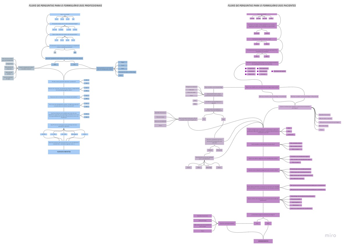
Based on the CSD Matrix prioritization and hypothesis formulation, we structured and created the survey forms with patient users and psychology professional users initially.
Flow of Questions created in Miro
Results obtained from the quantitative research
Qualitative Research
After having quantitative knowledge of the main problems faced by patients and psychology professionals, interviews were conducted via e-mail and telephone to deepen the understanding of their root cause. From the different perspectives of each one, and mainly: to find out WHAT and HOW to improve.
They like to attend online as much as face-to-face.
Agenda, notepad, and forms are necessary tools for attendance.
They don't agree with charging fees on online care apps because they already charge college patients token amounts.
Psychologists who already work online need a means to share materials for the purpose of interaction with patients.
Most psychologists charge less than the established rate for the university public.
They prefer sessions via smartphones over desktop.
Data usage is a reason for insecurity with online service.
The main disadvantage for those who consult online is not having a space with 100% privacy.
The need for immediate service with convenience are the main reasons why they consider the online format a good option.
The exchange of professionals in face-to-face service is not something simple. It is usually time consuming.
What conveys security about a professional and his service are the testimonials and references.
They prefer to pay per consultation rather than monthly fees, with prices ranging from R$50 - R$70.
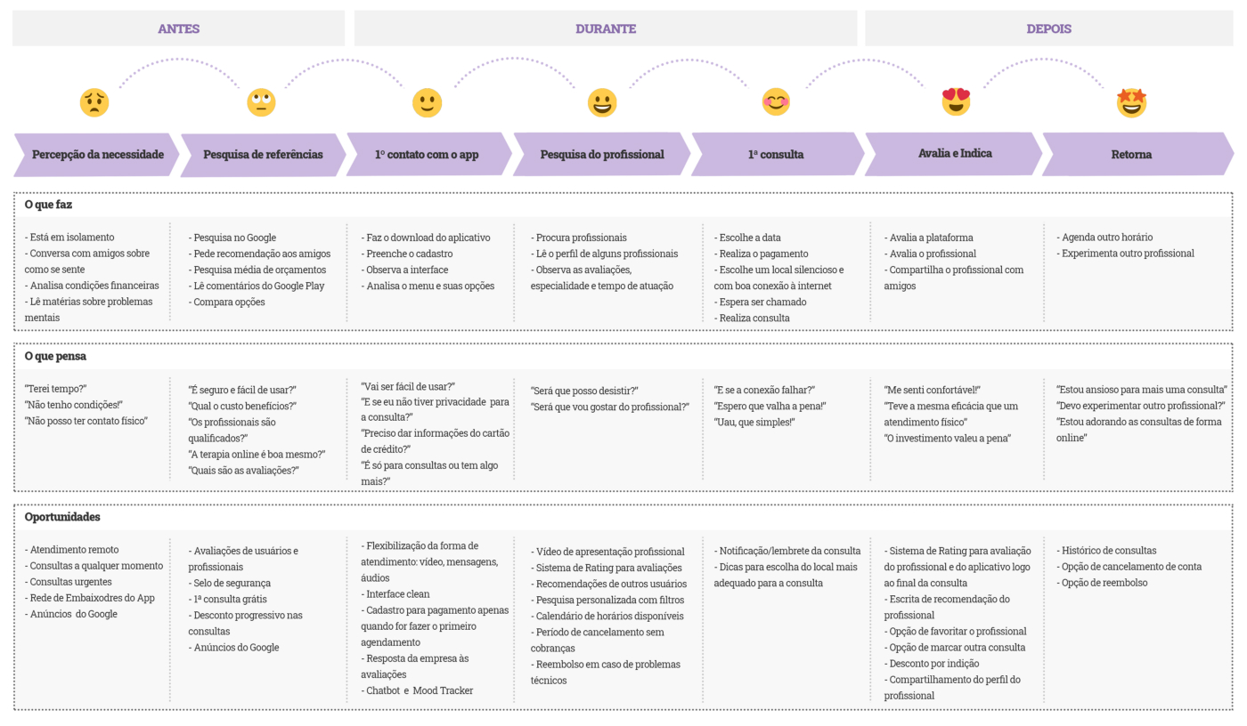
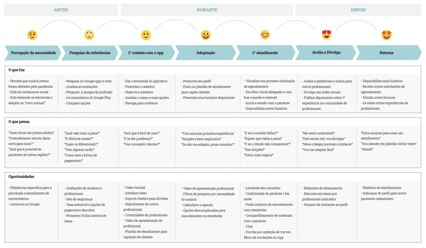
Personas & User Journey Maps
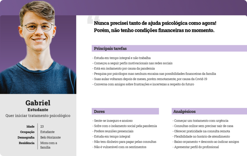
The insights from the research provided definitions for personas, journeys, and storytelling.
Personas:
Gabriel – Patient
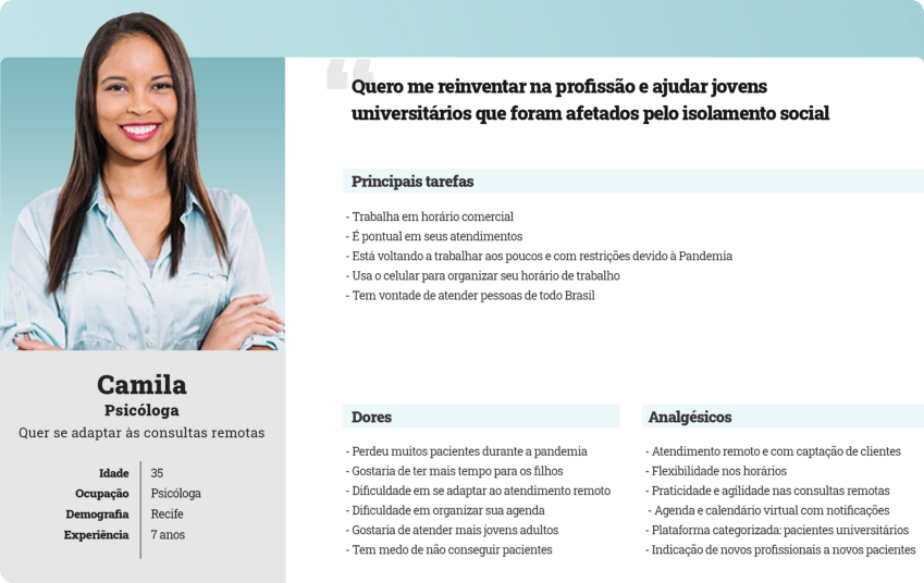
Camila – Psichologist
Solution Alternatives
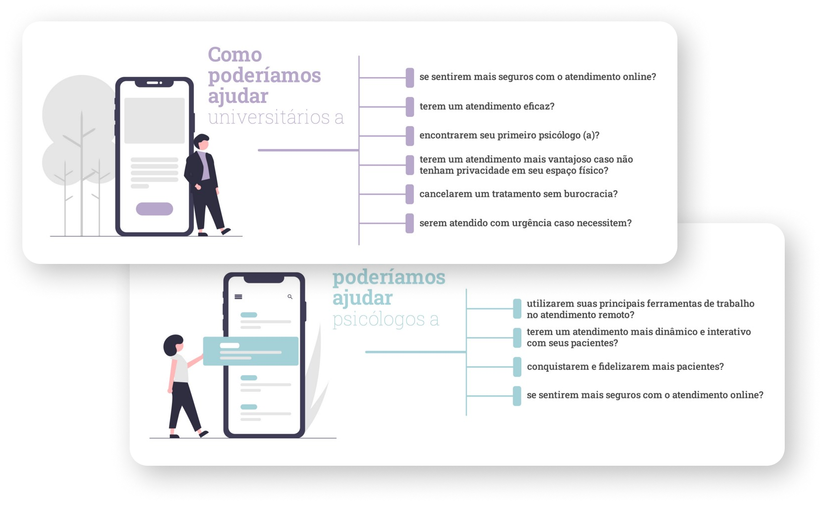
Having understood the points and perspectives of each of the users, we looked for alternative solutions. For this, we adopted the “How Might We” technique to rewrite business opportunities and achieve our goal.
As important as knowing what to do is knowing what not to do.
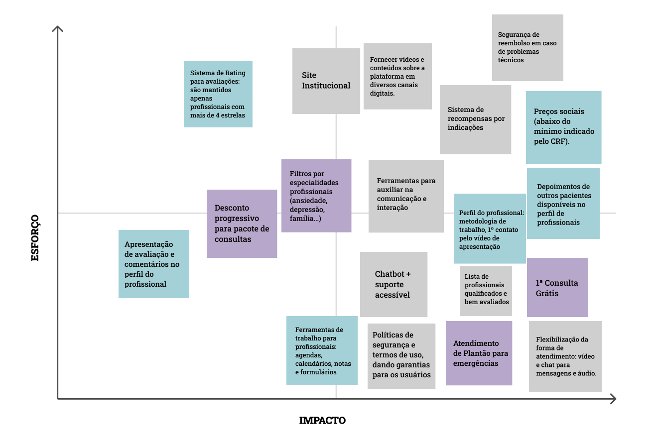
From this, we consider what would be more viable for both users using the Effort x Impact Matrix and thus build relevant solutions.
WIREFRAME
Designing a Solution
We designed some ideas thinking about the solution of the problem of psychologists and university users and thus we managed to develop something effective.
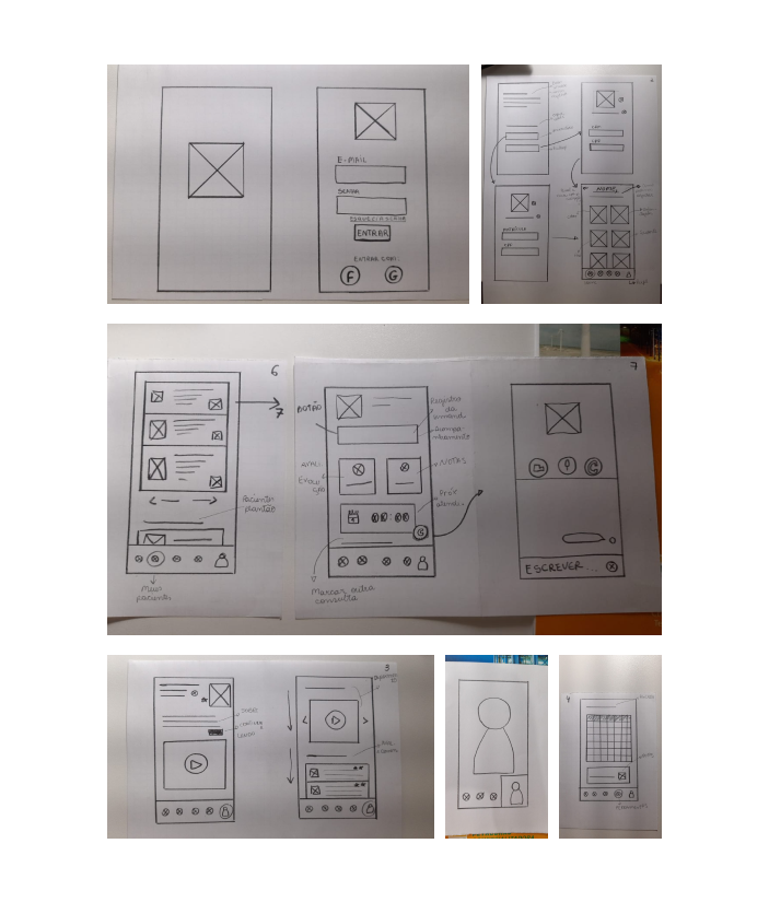
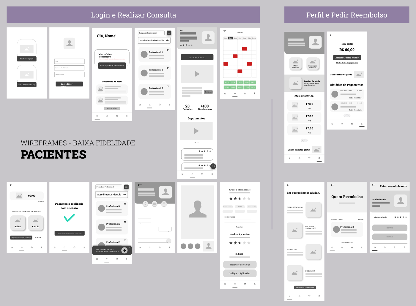
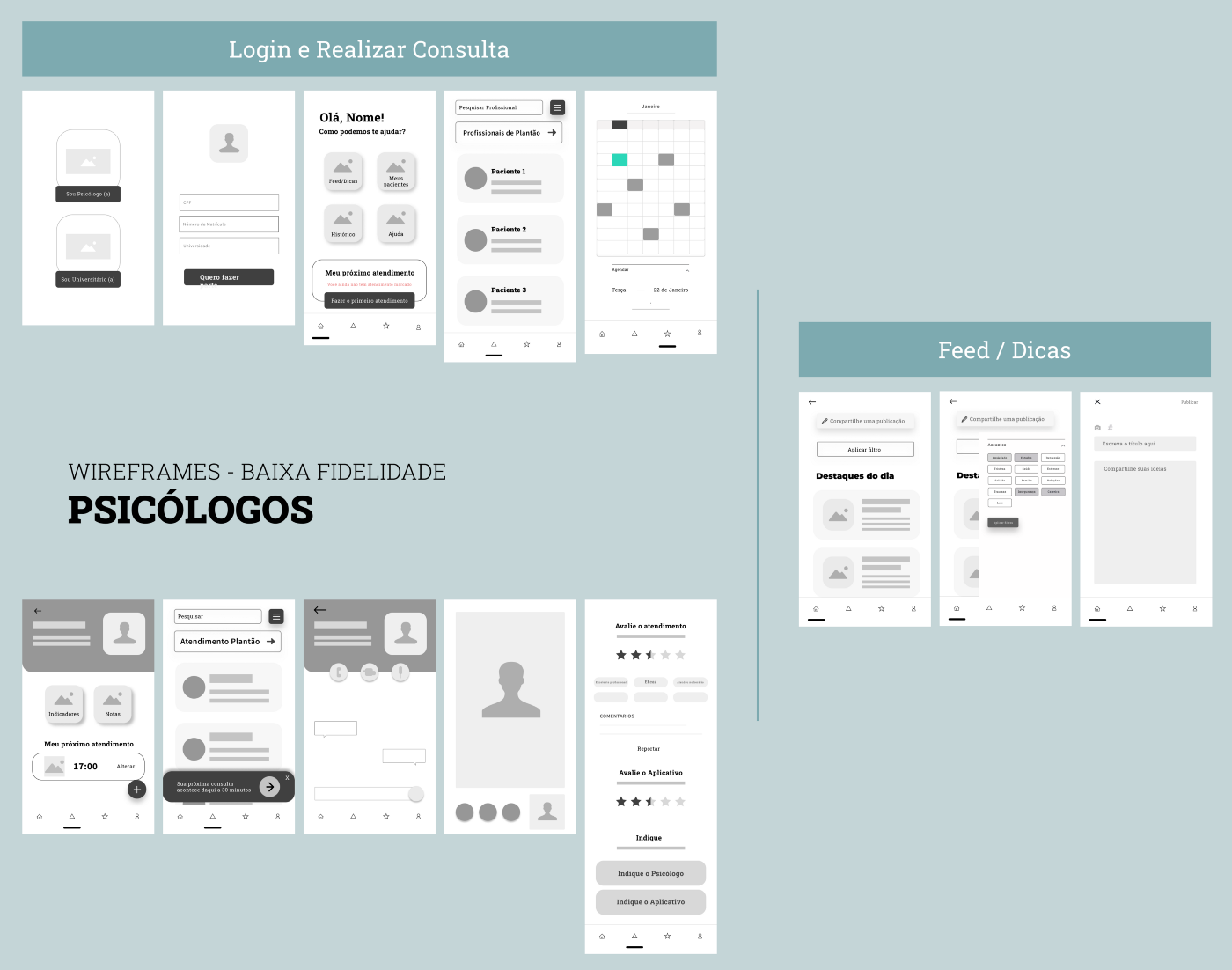
Based on the project drawings, we designed the project skeleton in what we call “Low-Fidelity Wireframes” to validate the functionality and usability of the application to the users. After all, their good experience is our goal.
Low Fidelity Wireframes — Patient Flow.
Low Fidelity Wireframes — Psychologists Flow.
Usability Testing – Low Fidelity Prototype
Before we started building the high fidelity prototype, we conducted some tests with users to verify the usability of what was designed. Some tests were conducted face-to-face and others online.
Insights Gathered from Patients
All users were successful in the action “schedule and make” the appointment.
Almost 100% of the users had extreme difficulty to request reimbursement for the consultation through the button “I need help”. For this reason we created a specific button for Reimbursement in the user’s profile and also added this option in the Payment History, since this was the place where users searched for it.
When asked why they did not look for the Refund in “I need help” they reported that this option referred only to technical support of the application.
We noticed that when completing the appointment the “Continue searching for professionals” button did not make sense. Users kept going back to Home, so we replaced it with a “Back to home” button.
Some users reported that the button “On-Call Attendance” referred to application support, so we replaced it with “On-Call Professionals”.
One of the users reported that to schedule an appointment it was necessary to scroll a lot on the screen of the professional’s profile to get to the “Schedule Appointment” button, so we brought it to the top of it.
As soon as the patient scheduled an appointment, a notice appeared telling how much time was left for the appointment, giving him the option to “close” or “click to go” as soon as he arrived at the appointment time and this, contrary to what we thought, was a very bad experience for the users as it was seen as a “Pop-up” or even “Spam”, leading us to change the strategy.
Insights Gathered from Professionals
The user flow within the application was uncomplicated and users did not have much difficulty to perform the actions of making the first appointment, consulting patients, and making appointment times available.
The time taken to perform each action, according to users, was related to the texts and absence of colors on the screens.
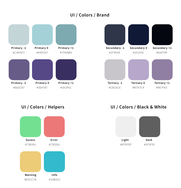
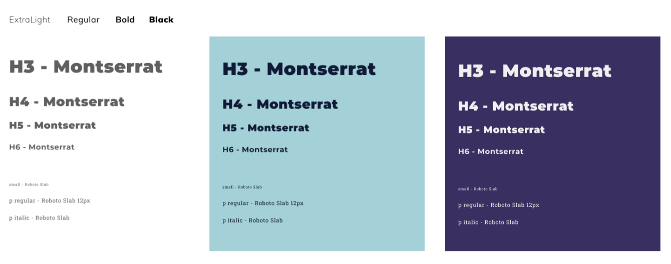
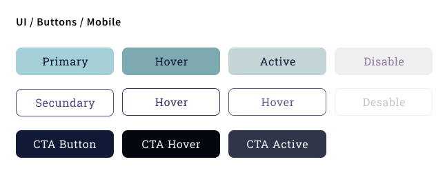
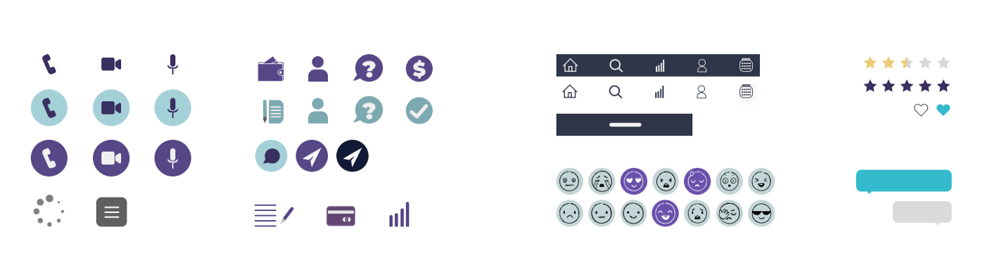
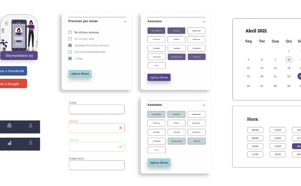
Style Guide
A identidade visual da marca é de extrema importância para se criar conexão e uma comunicação mais eficaz com seu público. Ela pode ser a grande responsável por fazer com que a marca seja sempre lembrada em seu nicho.
Colors: Primary colors such as blue and purple were chosen for the following reasons:
Blue: Transmits more security, confidence and inner peace;
Purple: Transmits calm, gratitude, respect, and meditation.
The darker shades of blue and the lighter of the purple, reinforce even more the concept and symbolism of these colors. We also created “Helpers” colors, that is, auxiliary colors to be used in cases of errors and alerts.
Typography: we chose the Montserrat and Roboto Slab typography (ratio 1.333) due to some important issues such as: harmony.
Texts with a rounded characteristic transmit more welcoming, familiarity, and have better readability for this public.
It has several styles helping in the differentiation of texts and paragraphs.
Buttons: The buttons were created based on the colors of the brand’s visual identity. They are easy to find and are the main facilitators for users to reach the desired destination, further improving their experience and flow within the platform.
Icons: They make the platform and the entire user journey even more intuitive, enabling quick coding of the message.
Forms: Like the buttons, the forms were created with the colors of the brand’s visual identity and their design was thought to facilitate the user’s flow within the application.